
Type updates - Issue #1

A new width for Peste!
If you've been following me for some time, you already know about Peste. I've been putting off the next update for a while, mainly out of boredom (yikes).

Plot twist! — I had this idea in the back of my mind, to add a condensed font to the family. And I'm in love again!
Adding this was just what I needed to make the project exciting again. I've just started working on this so it won't be available before a couple of months, maybe early next year.
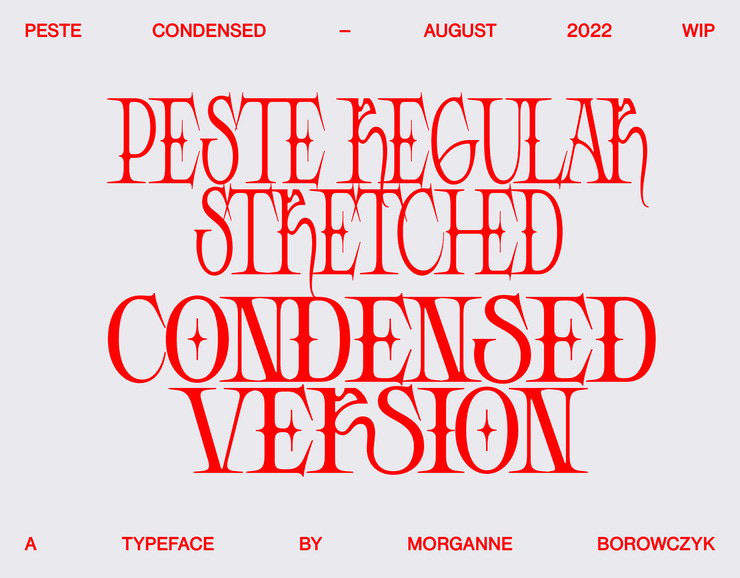
This width is born from seeing the original font stretched so — many — times. I must admit that the first time I saw it, I was offended (how dare you squish like this something I've spent so many hours on?)
But I've grown to like the look and some day realized people were stretching it vertically because the long serifs make it so *wide*, it needed a narrow version to fit tighter spaces.

This means next release will include both widths! Lowercases! Punctuation marks! New ligatures! Improved diacritics! Better kerning! I'm still debating on including numbers as they do scare me a lot. We'll see where that goes!
In the meantime, Peste Regular is on sale!
What about Sélénite?
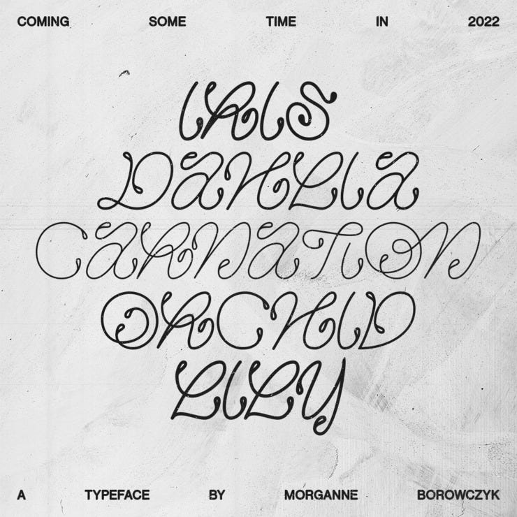
I haven't set a date for Sélénite yet either but most letters are drawn, I'm now focusing on adding more contextual alternates to make it feel extra organic and balanced.
It still needs a lot of testing with a huge variety of words to troubleshoot spacing problems. It'll be done when I've stopped obsessing over Peste Condensed.


I'm wrapping this up here and hope you enjoyed reading this!
Please feel free to send some feedback, both about this newsletter *and* the typefaces. Does it sound accessible enough if you're not a type designer yourself? Would you like this to be more technical?
Thank you for reading me and see you soon,
— Morganne